How Data Presentation Formats Affect Our Ability to Spot Trends and Extract Numbers
When it comes to presenting data, there’s an age-old debate: tables vs. graphs. Which one is better for helping people quickly understand information, spot trends, and make decisions? As part of my research, I set out to answer this question by testing how people interact with both formats. Here’s what I discovered.

The Problem: Tables vs. Graphs
In today’s data-driven world, we’re constantly bombarded with information. Whether it’s financial reports, sales data, or even personal budgets, how that data is presented can make a huge difference in how easily we understand it.
But here’s the catch: not everyone processes information the same way. Some people find tables intuitive, while others prefer graphs. This got me thinking: Which format is better for specific tasks, like extracting numbers or identifying trends?
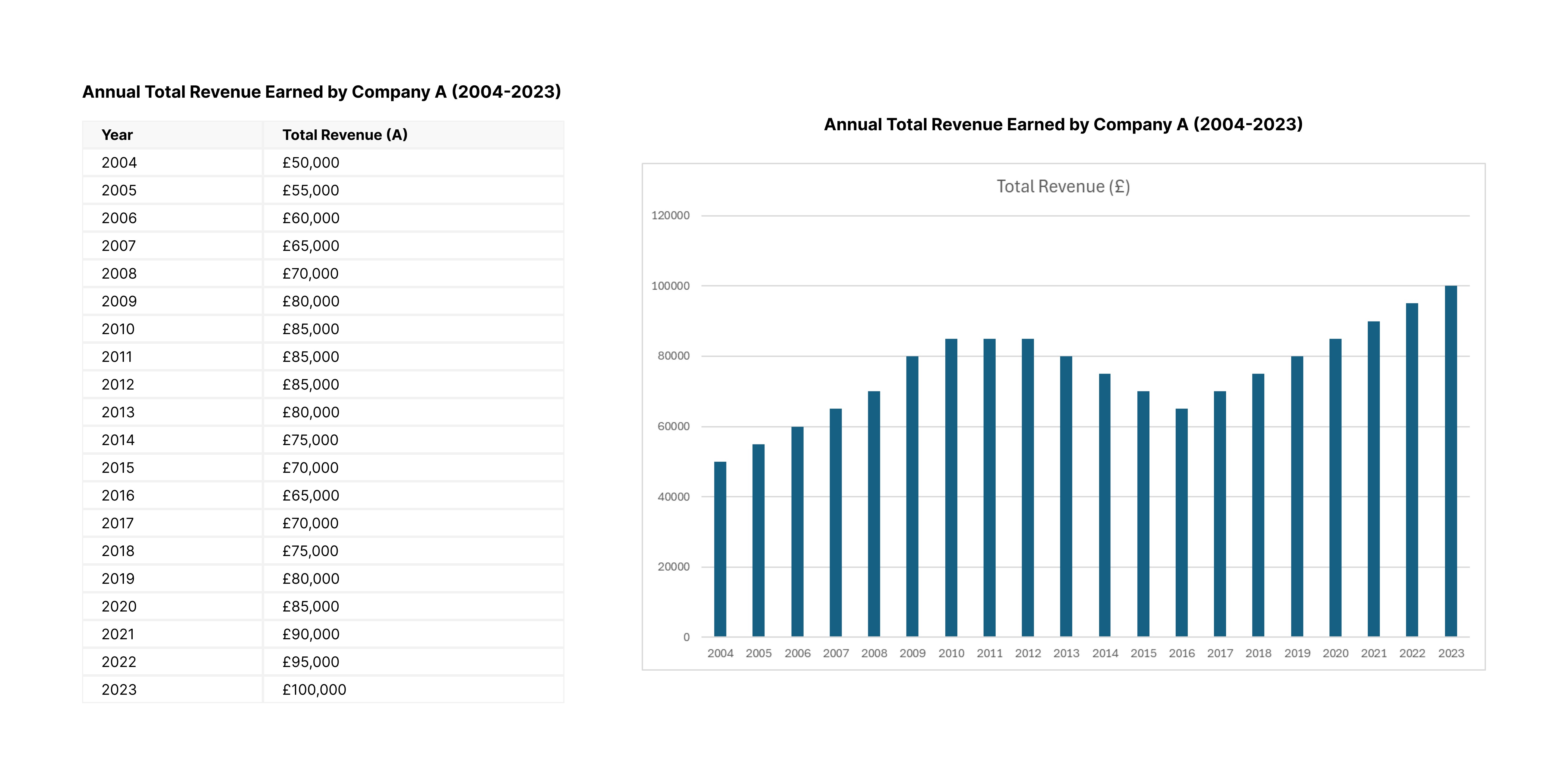
To find out, I designed an experiment comparing tabular data (think spreadsheets) with graphical data (bar charts) to see which one performed better in terms of speed, accuracy, and user preference.
The Experiment: Tables vs. Graphs in Action
I recruited 16 participants, ranging from 18 to 44 years old, and asked them to complete a series of tasks using both tables and graphs. The tasks involved:
Extracting specific values (e.g., “What was the revenue in 2018?”)
Identifying trends (e.g., “Is the revenue increasing or decreasing?”)
Estimating differences (e.g., “What’s the difference in revenue between 2010 and 2020?”)
Each participant worked with both formats, and I measured their time on task, accuracy, cognitive load, and preferences.
Key Findings
Tables Are Faster for Extracting Numbers
When it came to finding specific values, tables were the clear winner. Participants completed tasks 30% faster with tables compared to graphs. This makes sense—tables are straightforward and allow users to quickly scan for exact numbers.Graphs Are Better for Spotting Trends
Graphs outperformed tables when it came to identifying trends. Participants found it easier to see patterns and changes over time when data was presented visually.Tables Are More Accurate Overall
While graphs were great for trends, tables had a slight edge in accuracy across all tasks. Participants made fewer mistakes when working with tables, especially when extracting specific values or calculating differences.User Preferences Depend on the Task
When asked which format they preferred, participants’ answers varied depending on the task:Extracting values: 13 out of 16 preferred tables.
Identifying trends: 15 out of 16 preferred graphs.
Estimating differences: Most felt tables were easier, but some found graphs more intuitive.
Cognitive Load Was Similar for Both Formats
Surprisingly, there wasn’t a huge difference in how mentally taxing participants found tables vs. graphs. Both formats had similar cognitive load scores, though tables were slightly easier for extracting numbers.
What This Means for UX Design
The results of this study have some important implications for how we design data-heavy products:
Use Tables for Precision: If your users need to extract specific numbers or perform calculations, tables are the way to go. They’re faster and more accurate for these tasks.
Use Graphs for Trends: When the goal is to show patterns or changes over time, graphs are more effective. They make it easier for users to spot trends at a glance.
Consider User Preferences: Not everyone thinks the same way. Some users may prefer tables, while others lean toward graphs. Offering both options, or letting users switch between them, could improve the overall experience.
Mind the Data Volume: Large datasets can be overwhelming in tables, especially if users have to scroll endlessly. Graphs can handle larger datasets more gracefully, but they require users to “get familiar” with the data first.
Final Thoughts
There’s no one-size-fits-all answer to the tables vs. graphs debate. Both formats have their strengths and weaknesses, and the best choice depends on the task at hand.
As designers, our job is to understand our users’ needs and tailor the presentation format accordingly. Whether it’s a table for precise numbers or a graph for spotting trends, the right format can make all the difference in helping users make sense of complex data.
If you’re working on a data-heavy project, consider testing both formats with your users. You might be surprised by what you learn!
This post is based on my research report, “How Does the Presentation Format (Tabular Vs. Graphical) Affect Individuals’ Ability to Identify Trends and Extract Specific Numerical Values in Large Datasets?”